
Tuesday, February 3, 2015
Tuesday, January 13, 2015
Pantone's 2015 Color of the Year... Marsala!
MARSALAPANTONE 18-1438
Marsala enriches our mind, body and soul, exuding confidence and stability. Marsala is a subtly seductive shade, one that draws us in
to its embracing warmth.
Leatrice EisemanExecutive Director, Pantone Color Institute®
This is what Panone's website has to say about this "IT" color of the year...
Much like the fortified wine that gives Marsala its name, this tasteful hue embodies the satisfying richness of a fulfilling meal while its grounding red-brown roots emanate a sophisticated, natural earthiness. This hearty, yet stylish tone is universally appealing and translates easily to fashion, beauty, industrial design, home furnishings and interiors.
The Versatility of Marsala
- Equally appealing to men and women, Marsala is a stirring and flavorful shade for apparel and accessories, one that encourages color creativity and experimentation
- Flattering against many skin tones, sultry and subtle Marsala is a great
go-to
color for beauty, providing enormous highlight for the cheek, and a captivating pop of color for nails, shadows lips and hair. - Dramatic and at the same time grounding, the rich and full-bodied red-brown Marsala brings color warmth into home interiors
- An earthy shade with a bit of sophistication, texture is the story in print and packaging. A matte finish highlights Marsala’s organic nature while adding a sheen conveys a completely different message of glamour and luxury.


Wednesday, March 20, 2013
Burnout
We all run the risk of experiencing burnout out at work. Some of us more than others may have jobs that are completely emotionally or physically exhausting, and may be at more risk than others of burnout. Let's start with figuring out what burnout is exactly.
Burnout is a psychological term for the experience of long-term exhaustion and diminished interest. It can be described as a general wearing out or alienation from the pressures of work, or the development of feelings of cynicism or inefficacy.The Maslach Burnout Inventory uses a three dimensional description of exhaustion, cynicism, and inefficacy. Some researchers and practitioners have argued for an "exhaustion only" model that sees that symptom as the hallmark of burnout.
How pressure is dealt with determines how much stress someone feels and how close they are to burnout. One individual can experience few stressors, but be unable to handle the pressure well and thus experience burnout. Another person, however, can experience a greater number of stressors, but effectively deal with them, and avoid burnout.
Believe it or not, our physical environment can affect our level of burnout. Facilitative and supportive interior design does just that. It is the utilization of interior design and architectural design elements to prevent burnout and enhance your feelings of well-being.
It may be as simple as changing the smell of your work environment with candles or diffusers. Throw back your curtains and pull up your blinds and let a little natural light in. That alone will do wonders in preventing burnout. If you don't have a window, turn off those overhead fluorescent lights and turn on a desk lamp. Put a plant in your room to bring a little of the outside in, which has been proven to enhance efficiency and productivity. Get outside and take a walk through a natural environment to clear your head and gain perspective outside of your office environment.
A few design elements may help you as well. Add a new throw pillow or blanket to your bed or couch or rearrange your furniture to enhance the feel and energy flow of your home or office.
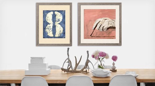
Put a new picture on your wall or photograph on your desk to remind you of your life outside of work or simply to bring a smile to your face.
Preventing burnout is all about balance in your life, mindfulness, and perspective.
Thursday, May 17, 2012
Friday, March 2, 2012
Lynes on Design Videos
Check out two shows we just taped for Lynes on Design taped at the Model Homes Park at Hilton Head Lakes
Tuesday, December 27, 2011
Christmas Joy
Freudian Slipcovers, supportive design, creating your sanctuary... what do those words really mean?
In everyday life, it is what HOME feels like and how it happens.
This holiday season, with my family surrounding me, my house felt like a HOME and was my personal sanctuary contributing to my personal health and well-being.
This year in particular, my family's gift giving revolved around a "home" theme. A Paella pan for home entertaining was a personal favorite gift. Why? Because, it looks amazing, but also because I am entertaining more at home to save money of course, and because the home is personal, comfortable and inviting for family and friends.

Equally as fantastic was a reindeer that was handcrafted by my daughter Kiki and will sit out year round to remind me of her even though she now lives hours away.With color and texture and creativity it is both sophisticated and whimsical and I LOVE IT!

Mollie, my youngest daughter, found an amazing piece of art that really is PERFECT for Lynes-Land (what we affectionately call my home). It is happy, colorful, and of course had critters in it! It is personal, so appreciated and really "feels" like it belongs. Always remember Good art does NOT match your sofa!!!!
Last but not least, Brandon, my audio-visual techie, gifted an Apple TV. I can't wait to figure out how it works. For a guy who grew up a bit of a gift giving scrooge, he has embraced his family, and his home in Florida is warm and loving.
My point to this posting is direct. Supportive and facilitative design can be very personal and exist on any scale from a personal home or a hospital complex to an entire community!
Monday, November 28, 2011
Color Confidence
I think a color pro is anyone who takes the colors in nature and uses them with confidence and pride in their home. For some, decorating a room with color may initially feel overwhelming, but it need not be. First of all paint is paint and can always be changed.
I suggest these few steps to help you decide on the color scheme for you.
* Look at your wardrobe. What colors do you gravitate toward? What colors do you wear often?
* What colors make you feel happy, serene, relaxed, stimulated, inspired?
* Look at the room or space that you intend to color. How is it used and how do you hope it will make you feel?
* Check out what you are using within the space that you already have, can you keep it or is it possible to change the color to work with your new color palate.

Once you have asked yourself these questions, you are ready to make decisions about which color will dominate, and which colors will be the secondary and the accent colors. Your goal is to create a balance; however, with color, rarely are colors balanced when used in equal proportion. According to many interior design and color associations the formula that is most successful is 70% of the room dominated by one main color (often walls and floors), 20% of the room in another (window treatments and upholstered furniture)and 10% of the room for accent color (often pillows and artwork).
Most importantly, do not forget to look at the lighting in your room. Color changes hues and value and tone according to the time of day and the amount and type of light within the room.

Subscribe to:
Posts (Atom)